ISTD | 2009 - ENVIRONMENT | TYPOGRAPHY | ENVIRONMENT
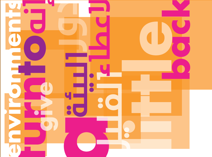
I decided to help the environment give a little back to typography, by forming a new, unique Latin and Arabic alphabet with the letters found within Beirut, Lebanon’s environment.
ISTD | 2009 - Environment | Typography | Environment
Concept:
The world today as we “know it” is made from many amazing forms, shapes and sizes. Ever looked at a building and thought to yourself, “Wow, how did they think of that?” If you look closer at each element that attracts you, you can actually see separate forms, typographic forms. Typography forms everything we see in our environment, from a road sign, to a 50-story building. By analyzing these elements we can better understand how these forms came to be and why. My research focuses on the Lebanon environment, culture and religion.
The Latin and Arabic letters and their forms were also researched, after having examined the forms of each alphabet, its time to research type in Lebanon’s environment, with day-to-day elements to religious and cultural ones. This form of research was completed by going out into the actually environment of Beirut, Lebanon (the capital, and cosmopolitan city) and finding characters that formed the environment.
The research and development helps me discover that typography forms the environment. From this conclusion, I decided to help the environment give a little back to typography, by forming a new, unique Latin and Arabic alphabet with the letters found within Beirut, Lebanon’s environment.
Design Solution:
Title:
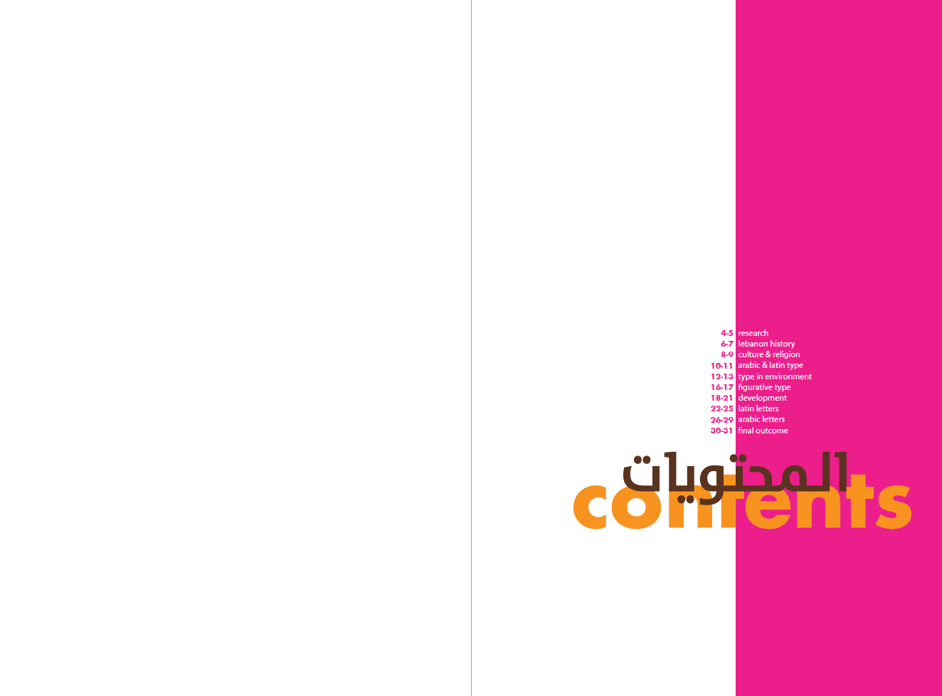
‘Mosaic’ when heard gives the basic dictionary meaning:
1. A combination of diverse elements forming a more or less coherent whole
2. A combination
The analysis of this word, gives the exact reason for using it as the title of the booklet.
Lebanon is a very cosmopolitan country, having 5 different languages you might hear while walking down the street, including: Arabic, English, French, Armenian and Syriac; which as a whole, make Lebanon. By using a synonym of ‘combination’ it would by easy to convey the message or meaning, in a unique and curious way.
Format:
A large format was used to suit the topic of a large environment, and to be able to show all the information needed. By using a 340x230 mm elongated format it shows strength and stability, in which reflects the buildings we see in Beirut’s environment.
The poster located near the end of the book, has a landscape format, and extends to 942mm. This gives the feeling of a panoramic photograph of the whole environment, but instead, shows the Latin and Arabic alphabet found in my surroundings.
Grid:
The grid consists of 4 columns, each 45mm wide, with a gutter of 5mm. All the margins in the layout are 15mm wide. A hanging line exists at 100m from the bottom of the page, to ensure that the books information layouts have the same feeling.
Typography:
Typefaces:
Latin: Futura Book and Futura Bold
Arabic: TheMixArab
Futura has been used as the Latin typeface, a sans-serif font designed by Paul Renner. It has been chosen for its simple clear design, good consistency of stroke weight and its clear counter, which will give it a strong form and shape. Because of its simplicity, Futura Book has been used for running text, for it is very easy to read. To give more feeling of the environments bold but fresh feel, Futura Bold has been used for headings and type as image. These two Latin typefaces Futura Book and Futura Bold are within the same type family, this helps them collate together very well.
When we have two different languages and we need to combine them, it is not an easy task, for sometimes they don’t have the same characteristics and weight so they don’t really work well. With Arabic and latin, they both have a solid baseline, but have completely different shapes and sizes, so it is very critical to pick a typefaces that work together. TheMixArab is a unique Arabic typeface and has different characteristics to the tradition Arabic calligraphy. It is simpler, lighter, and quite rounded, very similar to the characteristics of Futura. This is why this typeface was used in collaboration with Futura.
Heirachy:
The booklet contains a lot of big ‘text as image’. This is the first thing that catches the eye in each spread. By having these headings, the reader can easily understand the overview of the page, without even reading it. The order of importance goes from big and bold, and decreases in size. Sub-headings are placed on the top of body text, in 16pt and bold, whether it is Latin or Arabic there is no difference.
Type Treatment:
Arabic and Latin interact well together and work as a unit to give the best possible typographic solution in the work at hand. In type as image, Arabic and Latin have been used in a new and unique way. You can read the Latin alone, but if you read it with the Arabic, you will also get the same meaning, or maybe a little more!
Latin body text has been aligned to the left, showing the real way to read it, while Arabic has been aligned to the right for the same reason being, it is read from right-to-left, unlike Latin’s left-to-right normality.
Visual Treatment:
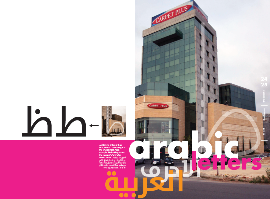
Because my research is about the environment and typography, many pictures were added to further explain my concept. Photographs were used taken from the Lebanon environments, and used to make a new Latin and Arabic Alphabet.
All photography in this book were taken by me in Beirut, Lebanon. Satellite images were borrowed from Google Earth, and figurative type images were from the Internet. No photo taken has had any major rendering that might help it better suit my concept.
Type as image is a main focus in my book, as the concept is typography as well as environment. These give each spread its own unique touch and help convey my message.
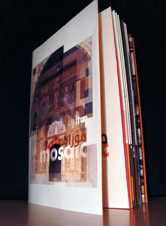
The cover as a photograph of a stunning old door, which is broken up in to pieces and placed with transparency one over the other, to give the Mosaic touch.
Colours:
Four main colours were used in this booklet:
Brown: A strong dark colour base, helps with contrast. Brown was chosen to give the impression of ‘soil’, a major element in the environment.
Orange, Hot Pink, Purple: There are many colours to choose from, and many we see in our environment. Instead of taking the usual environment colour (green) the three colours orange, hot pink, and purple were chosen, this moves away from cliché, and give more of the light fascinating approach, which is what I am trying to show. Choosing these three bright spring colours, shows the true brightness and uniqueness that the environment and type have to offer.
Poster:
A poster 942mm was added as a pullout near the end of the book. This contains all the Latin and Arabic alphabet derived from the photo’s I took in Lebanon’s environment. On each of the photo’s a feint white path traces the area in which the letter can be seen. The poster has been folded into the book, to be a surprise final output.
Title:
‘Mosaic’ when heard gives the basic dictionary meaning:
1. A combination of diverse elements forming a more or less coherent whole
2. A combination
The analysis of this word, gives the exact reason for using it as the title of the booklet.
Lebanon is a very cosmopolitan country, having 5 different languages you might hear while walking down the street, including: Arabic, English, French, Armenian and Syriac; which as a whole, make Lebanon. By using a synonym of ‘combination’ it would by easy to convey the message or meaning, in a unique and curious way.
Format:
A large format was used to suit the topic of a large environment, and to be able to show all the information needed. By using a 340x230 mm elongated format it shows strength and stability, in which reflects the buildings we see in Beirut’s environment.
The poster located near the end of the book, has a landscape format, and extends to 942mm. This gives the feeling of a panoramic photograph of the whole environment, but instead, shows the Latin and Arabic alphabet found in my surroundings.
Grid:
The grid consists of 4 columns, each 45mm wide, with a gutter of 5mm. All the margins in the layout are 15mm wide. A hanging line exists at 100m from the bottom of the page, to ensure that the books information layouts have the same feeling.
Typography:
Typefaces:
Latin: Futura Book and Futura Bold
Arabic: TheMixArab
Futura has been used as the Latin typeface, a sans-serif font designed by Paul Renner. It has been chosen for its simple clear design, good consistency of stroke weight and its clear counter, which will give it a strong form and shape. Because of its simplicity, Futura Book has been used for running text, for it is very easy to read. To give more feeling of the environments bold but fresh feel, Futura Bold has been used for headings and type as image. These two Latin typefaces Futura Book and Futura Bold are within the same type family, this helps them collate together very well.
When we have two different languages and we need to combine them, it is not an easy task, for sometimes they don’t have the same characteristics and weight so they don’t really work well. With Arabic and latin, they both have a solid baseline, but have completely different shapes and sizes, so it is very critical to pick a typefaces that work together. TheMixArab is a unique Arabic typeface and has different characteristics to the tradition Arabic calligraphy. It is simpler, lighter, and quite rounded, very similar to the characteristics of Futura. This is why this typeface was used in collaboration with Futura.
Heirachy:
The booklet contains a lot of big ‘text as image’. This is the first thing that catches the eye in each spread. By having these headings, the reader can easily understand the overview of the page, without even reading it. The order of importance goes from big and bold, and decreases in size. Sub-headings are placed on the top of body text, in 16pt and bold, whether it is Latin or Arabic there is no difference.
Type Treatment:
Arabic and Latin interact well together and work as a unit to give the best possible typographic solution in the work at hand. In type as image, Arabic and Latin have been used in a new and unique way. You can read the Latin alone, but if you read it with the Arabic, you will also get the same meaning, or maybe a little more!
Latin body text has been aligned to the left, showing the real way to read it, while Arabic has been aligned to the right for the same reason being, it is read from right-to-left, unlike Latin’s left-to-right normality.
Visual Treatment:
Because my research is about the environment and typography, many pictures were added to further explain my concept. Photographs were used taken from the Lebanon environments, and used to make a new Latin and Arabic Alphabet.
All photography in this book were taken by me in Beirut, Lebanon. Satellite images were borrowed from Google Earth, and figurative type images were from the Internet. No photo taken has had any major rendering that might help it better suit my concept.
Type as image is a main focus in my book, as the concept is typography as well as environment. These give each spread its own unique touch and help convey my message.
The cover as a photograph of a stunning old door, which is broken up in to pieces and placed with transparency one over the other, to give the Mosaic touch.
Colours:
Four main colours were used in this booklet:
Brown: A strong dark colour base, helps with contrast. Brown was chosen to give the impression of ‘soil’, a major element in the environment.
Orange, Hot Pink, Purple: There are many colours to choose from, and many we see in our environment. Instead of taking the usual environment colour (green) the three colours orange, hot pink, and purple were chosen, this moves away from cliché, and give more of the light fascinating approach, which is what I am trying to show. Choosing these three bright spring colours, shows the true brightness and uniqueness that the environment and type have to offer.
Poster:
A poster 942mm was added as a pullout near the end of the book. This contains all the Latin and Arabic alphabet derived from the photo’s I took in Lebanon’s environment. On each of the photo’s a feint white path traces the area in which the letter can be seen. The poster has been folded into the book, to be a surprise final output.


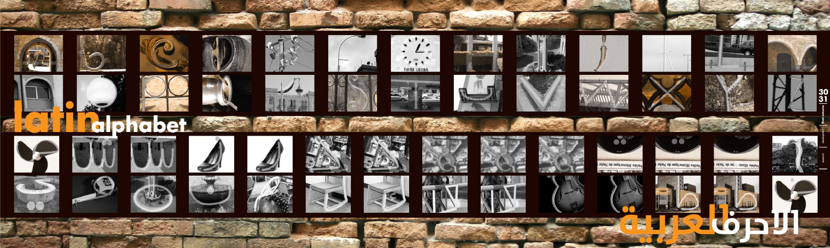
POSTER: Arabic & Latin alphabet derived from objects in the environment

Sketch book / Scrap Book / Research book
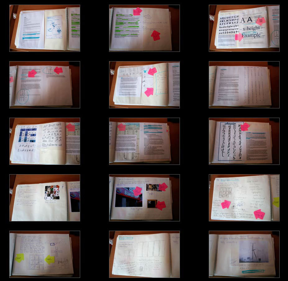
Sketch book / Scrap Book / Research book (continued)

Sketch book / Scrap Book / Research book (continued)

Sketch book / Scrap Book / Research book (continued)

This project had me accepted into the ISTD (international Society of Typographic Designers) www.istd.org.uk
You may also like
2011
I love my VW -VW Community Site
2011
Print
2011
Corporate identity
2014
Dubizzle | UAE Motor Statistics Infographic
2011
Siblou - Do the Fish Campaign Material
2014
SpotNet Identity
2014
Dress Me Up
2014
Beirut Music Festival - Pepsi Booth Branding
2014
Max Factor Arabia Packaging - @ Leo Burnett Beirut
2014
Dell Laptop Range Window Branding for SETS Solutioins